US Healthcare
I was commissioned to create reference sheets explaining US’s healthcare system, and how it compares to the rest of the world. The goal is to establish how the US’s healthcare system is lacking compared to other countries, and to use ideas from other countries to better our own. The commissioner, a medical doctor, would then use these sheets as reference to advocate to politicians to try changing how the healthcare systems work at least in the local area.
This required reading through T. R. Reid’s “The Healing of America” which breaks down the various healthcare systems, and the author’s experience with healthcare in multiple countries. After reading through, the commissioner and I had multiple discussions on what information to include, and this was the result!
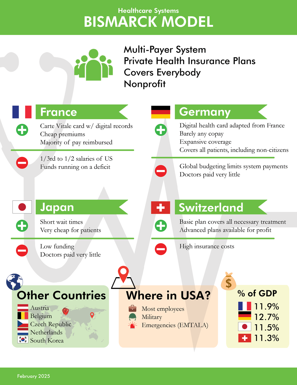
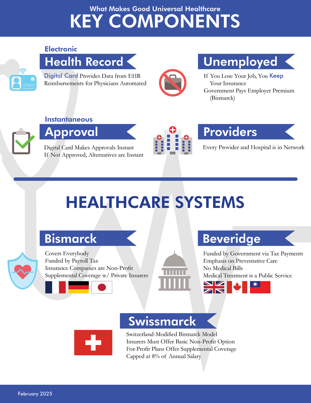
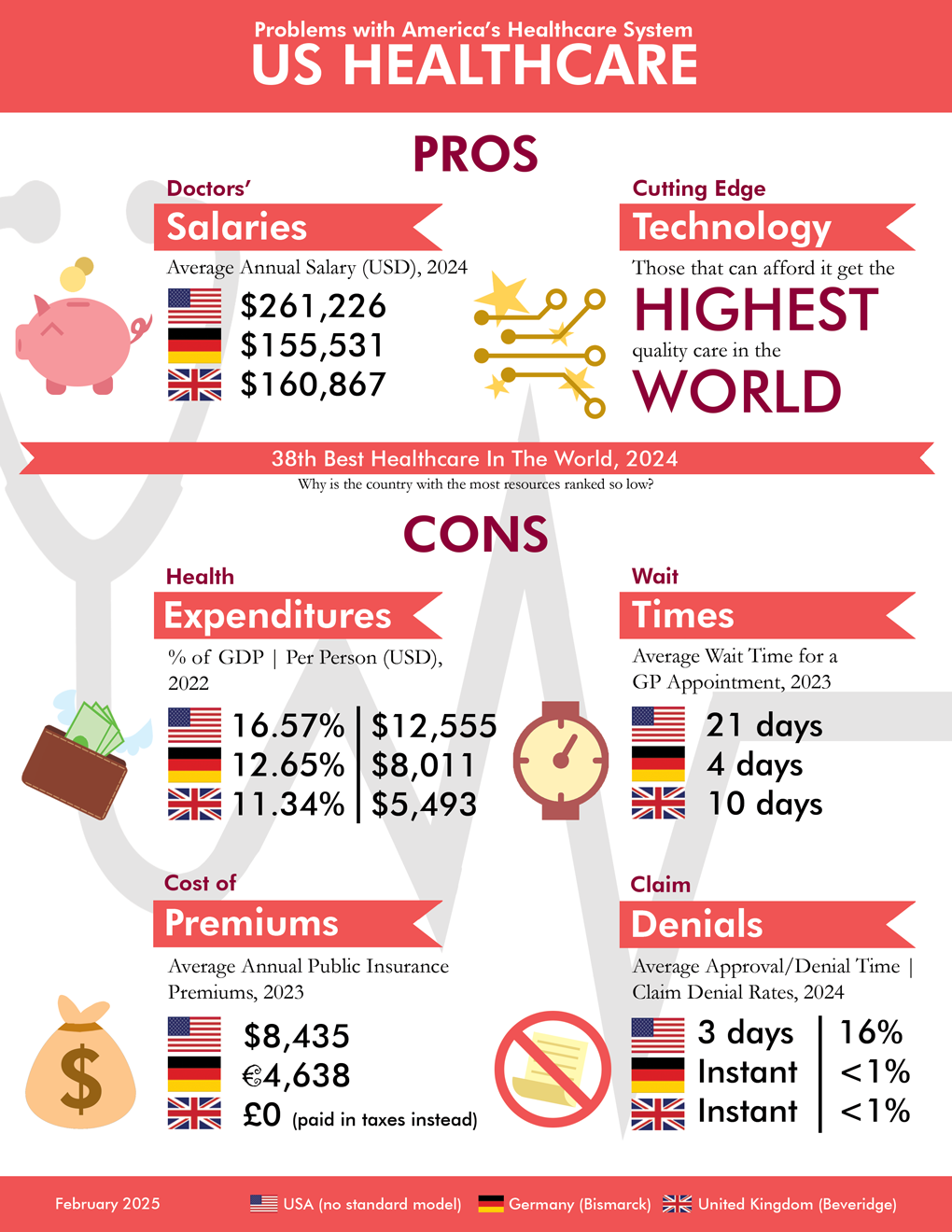
Key design elements and motifs here include the consistency in layouts but with varying colors to distinguish each printed page, the matching headers, varying fonts to distinguish information hierarchy, the flat design illustrations, and the matching layout structure of each page. Also because these are intended for print, the designs are relatively minimal, for example with a simple white background compared to the digital projects above.
Smash Power Ranking Banners

Local Smash communities throughout the world create seasonal rankings referred to as “Power Rankings” or “PR,” representing the best players in the area. I’ve created several graphics representing these rankings for the North County San Diego subregion. These graphics have unlimited potential for creativity, and can often even be a bit of motivation for players to rank high enough to get on the rankings.
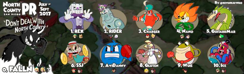
The first image uses images from the game “Cuphead”, which was an exceptionally popular newly released game, just a few days prior to the end of the season. Each icon has some kind of similarity to the character that the player uses in Smash. For example, the player Wuis (#9) plays Ryu from the game Street Fighter, while the Cuphead character above Wuis’s name (named Ribby) is coincidentally inspired from the same character. In Falln’s case (#0), his Cuphead character represents the final boss, only fitting for the strongest player in the region.
The second image borrows the theme from the game “The Legend of Zelda: Breath of the Wild”, one of Nintendo’s biggest Switch launch titles releasing in the last month of the PR season. The person on the right is a top smash player, ESAM; this image is a popular meme shot, taken after he gets a big win at the most competitive Smash Wii U tournament of all time, in the same month. He looks absolutely bloodthirsty after the win, as he stands up and faces the audience. The humor here is that it takes this same shot, mimicking the protagonist from the Zelda game, Link, looking outward as if he’s ready to explore the world (being an open-world game). It combines two big, recent events related to gamers, creating this graphic where the combination likely won’t ever be seen anywhere else.
The formatting is to accommodate Facebook group cover photos, since Facebook groups were the most popular way of finding local Smash communities at that time.
Twitch Stream Designs
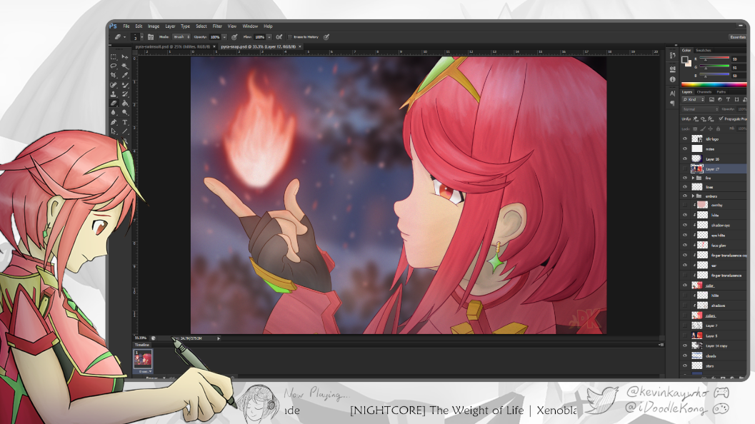
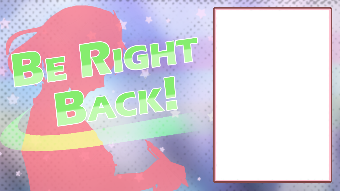


I designed my own stream layouts for Twitch, where I occasionally do art streams for friends to watch while I draw. Most of my art is based on the Xenoblade game series, and thus my designs are based on that as well. The blank canvas on the “Be Right Back!” screen allows a showcase of my previous art pieces that change over time. All of the illustrations are done by me as well!
The Ultimate Notebook – Sample Pages

See more here! https://kevinkaywho.com/notebook/
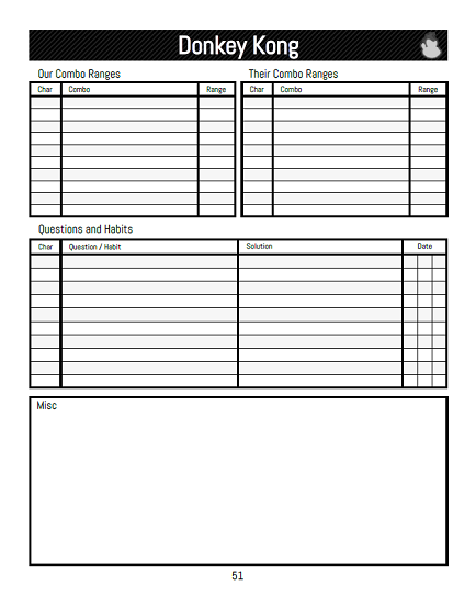
Smash Ultimate Donkey Kong Reference Graphic


In Super Smash Bros. Ultimate, Donkey Kong has a notable KO confirm called “pDKO.” This confirm works only when the opponent is at a given health value (aka percent); these are the ranges shown under each icon. Icons with colored backgrounds represent the opponent under a specific state, i.e. a passive ability that affects their stats.
Multiple variables however can affect these ranges; these are what the tables represent, and by how much you adjust the ranges. Stage refers to the map the players are fighting on. “Staling” refers to how many times you’ve used a given move prior (the two moves here being “Uair” or Up Aerial, and “CUT” or Cargo Up Toss); the more you use a given move multiple times, the weaker it gets. “Rage” refers to how much damage the attacker (Donkey Kong) has; the higher the percent, the more knockback their attacks do. “Stage” refers to the map that the players are fighting on, as stages have various ceiling heights (aka “blast zones”) which affect these windows.
The graphic is formatted in a way to be best suited for mobile, as a wallpaper. This way, competitors can pull out their mobile device in the middle of a tournament, referencing the specific data within just a literal second or two. The margins are added to accommodate for the variable zoom in set automatically on the device.
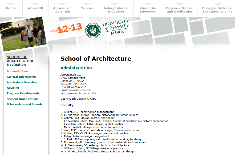
UH Manoa Catalog

Every year, the University of Hawaii at Manoa hosts a design contest to create the next book cover for the school catalog. This then becomes the inspiration for the design motifs inside the catalog, as well as the catalog website. I ended up winning that year! (As a bonus, I snuck myself into this cover… I’m the guy directly above the UH logo, in jeans!) You can see how the design carries over in the images below (not designed by me).

T-Shirt Design

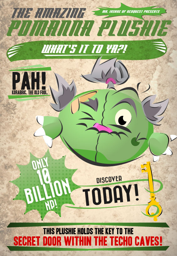
Neopets Design Contest
Flyers and Ads


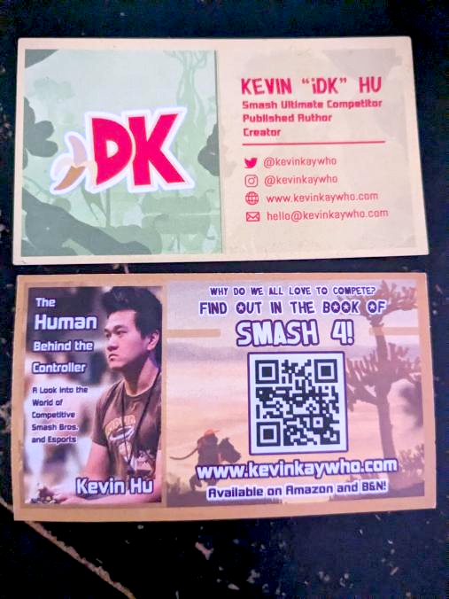
Business Cards